Thursday 24 November 2011

Production for Visual Communicators

Principle 5 – The Experts

Ansel Adams is a famous photographer who was born in San Francisco, California 20th February 1902, he was an only child and he died on the 22nd April 1984. He spent a lot of time in Yosemite Valley every year from 1916 until his death he began using his Kodak box brownie that his parents brought him for his first camera. After using this camera on his walks and exploring Yosemite Valley this is where his love of photography began. He loved all nature and this was the kind of images he loved to capture, they often showed no sign of mans presence it was all just natural things. In 1932 the F64 group was formed with Ansel Adams, Imogen Cunningham and Edward Weston. The whole idea of this group was the fact that they wanted all of their images to be all in focus so they looked like photographs and not paintings or images with shallow depth of fields. To do this they used apertures of F64 on large format cameras to create sharp images to capture the highest level of detail possible.


http://www.masters-of-photography.com/A/adams/adams_monolith_full.html

This is a photograph taken by Ansel Adams in 1927 and is called “Half Dome.” He originally took this image with a yellow K2 filter which was the standard filter at the time. He then decided to forget what it looked like and see what it felt like he had one plate and a strong red filter. At first the sky was bland with no depth and the shadows had no strength, changing the filter made the difference and made the image that he wanted. (Booth 1983, P.10) I think you can always tell his work because of the high quality and time and effort that is involved in it the fact that they are on large format camera at F64 and everything is perfectly sharp and in focus makes these images have more of an impact upon us I think if they were in colour and shallow depth of field they would look nowhere near as good and would be completely different as I think he has his own very distinctive style and that is what I love about his work.

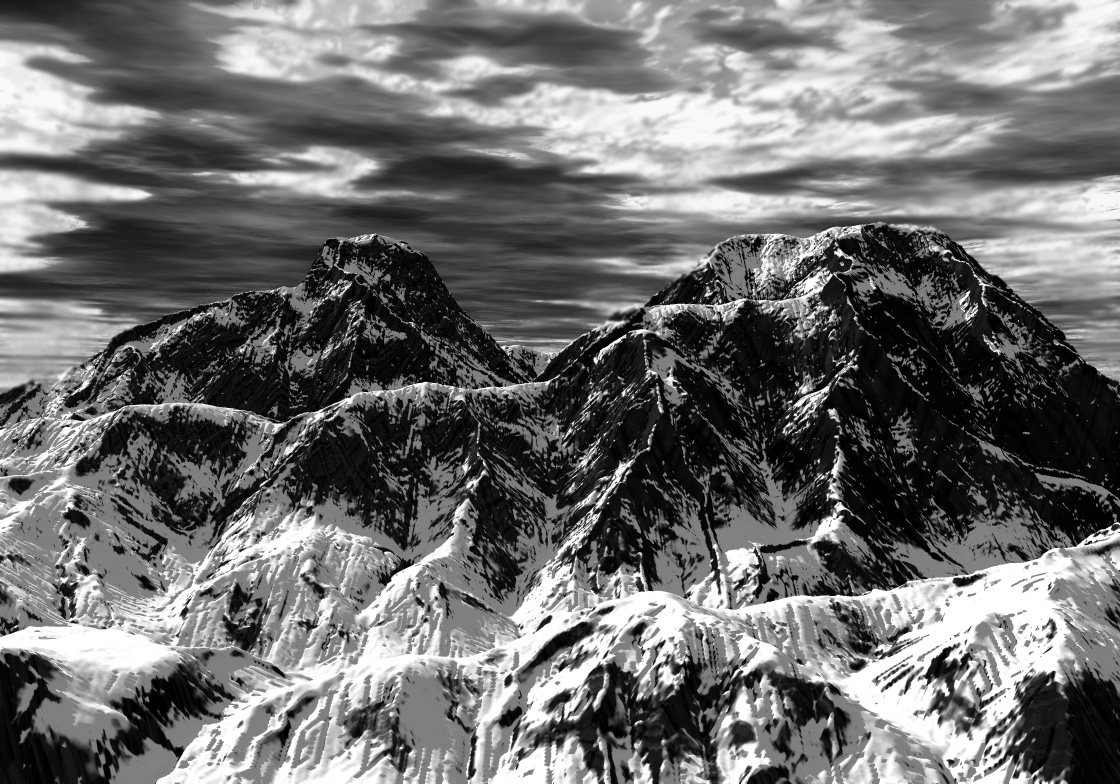
This is another of the images by Ansel Adams, I think the contrast between the black and white is amazing and the detail makes the image to be really striking. I think he has captured the textures really well and there is a nice tonal range within this image. The sky also has texture and because it is on film and in black and white it really adds depth to the image and creates an atmosphere instead of if it was just plain black or white sky.


This is another image by Ansel Adams and was taken in 1934 and is called Lake Near, King Canyon, National Park, California. I think again this really shows his still in photography and the amount of time and effort he put in because not only did he take the images on film he processed and printed them as well so he would have spent a lot of time on each individual image and he would have also only had a certain number of images he could take per film. I really like the level of detail within this image and also the reflection in the water is really striking within the image.

Sunday 13 November 2011

Development of ideas and structures in moving image

Principle 3 pre-production Character Design

Every character has to be designed and there is a process in which the person designing the character has to go through. The main things are the dialogue so this is how the character speaks and what they say so if they have a catchphrase or something in which they are known for saying. Are they are a stereotype, this is a good way of creating characters as it is someone who everyone can relate to. There is also what the character looks like and their appearance then the actions and what they do and lastly the interaction with other characters.

A really good example of character design is Vicky Pollard from Little Britain, this is a definite stereotype of a teenager with attitude and someone who is very “chavy.” When they designed this character they got inspiration from people on the streets and have made her to be a funny character and someone who people can relate to.    

As you can see from this image her appearance is always a pink jacket and leggings she also has lots of rings and false nails. She wears lots of gold which also adds to her character and can look a bit cheep and tacky. Just by looking at her you can tell she has attitude.


This is another image of Vicky Pollard and you can see what she is like just by seeing the image which is how they have used a stereotype to make the character memorable. She has a lot of memorable quotes and sayings and she speaks very incorrect and fast and quote common. This is a quote from Vicky Pollard “No, but, yeh, but, no, but,, what are they doin' on our patch or sumthin' or nuffin' or sorta like thing coz they is well gonna get beat-ins!” By missing the g of the ends of the words allows her to have a specific dialogue and she also gets herself in to trouble by saying about someone who was gossiping and then ends up saying something she has done. http://littlebritain.wikia.com/wiki/Vicky_Pollard
This is an image of her with her mom and as you can see they have the same style but different colours and they both use the same speech and dialogue so you can tell they are related and are both created from the same stereotype.

The interaction with them and the other characters they end up getting theirself in trouble and the dialogue is a huge thing with the interaction with other characters and because this is a comedy series it is based on stereotypes and people who will be memorable and you defiantly remember Vicky Pollard as she is a very well created Character.
This is an image of a group of characters from Little Britain and you can see how they all appear different and look different and they all have different rolls within the series and they show how you can create a variety of different characters and by their interactions with each other and their speech and quotes they can be very memorable. To say that most of these characters are done by Mat Lucas and David Walliams makes it even more interesting and the fact that it is played mainly by two people and they can still look so different and have individual characters is really good.

Development of ideas and structures in moving image

Principle 1 Story Development

When a film is made it goes by a 3 act structure, this is the beginning, middle and end and is shown by setting the scene and establishing what the film is about, then there is some sort of crisis or a twist and then there is how that problem is resolved. This is the same in pretty much all the films and whichever genre it is so comedy, romantic, action, thriller or chick-flick they all go by this three act structure and a film wouldn’t be the same without this. In a 2 hour film it is normally 30 minutes for the beginning 60 minutes for the middle and then 30 minutes for the end of the film. This makes sense to the viewer for it to be like this without even having to think that there is a particular structure to it you just know it is correct and flows together nicely.


This is the film bride wars and this has a very good and obvious 3 act structure. It is shown really well and makes the film really good and interesting to watch. This is a good example because the 3 act structure is really clear.


http://www.moviemuser.co.uk/Reviews/36/Bride-Wars.aspx


This is an image from the beginning of the film when it is setting the scene and this is showing that these are two girls who have been best friends from a very young age and have always loved the idea and have dreamed of getting married to someone when they’re older. They have spent a long time planning and putting together little scrap books of how they would imagine their wedding to be and this started by them going to a wedding when they were young and they wanted to get married then at this specific venue.


This is an image now from the film and they are older and still best friends and they are both now engaged and they have just came out from booking their dream wedding at this venue and they both have a date and are going to be each others made of honour. They are both really happy and it is all going really well.

That is the first part in the 3 act structure and is the introduction and establishing what the film is about.


This then leads nicely in to the second part of the 3 act structure which is the crisis and the middle of the film. This is where they find out their weddings have been accidently double booked and are on the same day. This means they can’t go to each other’s wedding and that one would have to change it. None of them change the wedding date and they are then set out to spoil the other ones day and play tricks on each other such as putting a blue die instead of blonde and a very strong spray tan rather than a subtle one.
http://moviebugz.blogspot.com/2009/05/bride-wars-2009.html

This is now when they see each other at their weddings and they decide they have been silly and this is the resolve of the film as they make up and Emma decides she’s marrying the wrong man and ends up marrying Livs brother. It all ends happily and this is how the problem is resolved.

Wednesday 9 November 2011

Productions and outcomes

Principle 3 – Medium

People work in several different mediums and within these mediums it is important for other people to know about you and what you do. There are several different ways of doing this, such as videoing things and putting it on to YouTube, creating your own blogs showing your work, they can have exhibitions so that people get to hear about them and just advertising who they are and what they do. There are benefits for doing commercial client based work and then work that is just for fun and some which you would like to create.
http://rankin.co.uk/advertising/#/pic41
This is an example of a commercial advert which Rankin has created and this shows he has worked with a client and asked them what they wanted out of their advert and what it is advertising and then this is what he has came up with. I think this is a very good striking advert and one that you would remember so therefore it has achieved what it needed to by being eye catching and advertising something.

http://rankin.co.uk/beauty/#/pic148

This is another piece by Rankin however this is something in which he has created more just for fun and is a lot less commercial than the other piece. This is good to show that he has a variety of skills and is also showing people what he is about and the kinds of things in which he enjoys doing. By looking at this we can see it is a very creative piece with a simple idea and shows he is a fun person and enjoys what he does.

 Both of these pieces are important but both for different reasons, there are many different ways in which you can promote or get your name out to people and then there are times to work with clients and then time to work with a customer and just do something fun to let people know what you are about.

Monday 7 November 2011

Productions and Outcomes

Principle 2 – delivery

When a creative is going to create something they will need to think about the final delivery of what they are creating. They will need to think about the location and if they are using technology which would affect this, and the size shape and scale of what they are creating is also important and something they need to consider. There are several different platforms which will also affect how and what they create, these platforms are editorial (magazines, newspapers), publishing (books, brochures, posters), on-line (animation) and advertising and branding (film, leaflet, brochure, bill boards). These will have an impact on how it is created, if your take a photograph for a business card it will be quite small so won’t need a large file, however if you take a photograph to go on a billboard it will have to be blown up huge so it will therefore need to be a lot higher quality and resolution for this to be able to be created. This can course problems because if you don’t have the correct equipment to be creating this then it might be ok for a magazine article or a leaflet but when it comes to a billboard you could experience problems.   

This is an example of an advert which could easily be seen on a billboard, it is large scale and the person jumping out to their motorbike makes it look a bit 3D and adds perspective to the image. This would be very effective as a billboard and would be eye catching and get peoples attention. It also looks the correct proportions for a billboard and has a simple message which is easily understood and doesn’t take too much concentration to know what the message is saying.

This is an example of a different platform, a magazine and this is an editorial piece and this is different to the billboard as it is a lot smaller and therefore the image and type can also be a lot smaller. There is more information provided on this magazine as it is the front cover and wants you to pick it up and read it. You would have more time to look if you were in a shop rather than if you were just passing a billboard as you would just have a quick glance or look if the traffic lights were on red. I think these pieces both work very well for their particular platform and they would be totally different if they were swapped round because it wouldn’t be correct.