Saturday, 29 October 2011

Principle 4 – Tone of Voice

When you look at something you can see what tone of voice it has or what the theme of the particular magazine or advert is. By using different fonts and images you can change the tone of voice of something and make it look completely different. When you look at a form they can be quite complicated, by simplifying it and using a clear structure you can change the tone of voice and make it a lot more approachable. The audience also has an impact of the tone of voice and it also links in with whether something in legible or not.


*       

This is an example of the front cover of a magazine and in this you can see that it is pink and very simple and has a good structure, it uses two main colours and that along with the text and image sets the tone of voice. The fact that this is simple makes it a lot better and more understandable.


*       

*       

*     This is another magazine cover and this is again very simple and the image and font set the tone of voice. These are two magazines and they have totally different tones of voice. We can tell this by looking at both of them they both have a totally different feel and this is due to their target audience and tone of voice. This has a feel of minimalism and is just using two basic colours and manipulation where as the other image is a lot brighter and has a totally different look.


*   We can see now by looking at different magazines and adverts how they can have different tone of voice’s and how we can tell now the audience and the intension of the magazine. Tone of voice is all about getting your message across in the way in which you would like it to be seen.

*       

*       

Principle One –Legibility

When people design something such as a magazine, a business card or a billboard it is important to make it legible. There are a lot of simple things which can be involved in the legibility of an image. If you have a piece of text the simple thing is can you read it? There can be several things which can improve how legible something is and whether it will be understood or not. One of these things would be the type that is used what font is it? And can you read the font or is it too big or small or an awkward font to read?
Depending on the size of the media will affect how big or small your type needs to be, if it was for a billboard it will have to be a lot larger than the type on a business card. Alignment is also something which you need to consider if it is all aligned left, right or in the centre then that is normally very legible however if some of it was aligned right and some aligned left then it would be confusing of where you are supposed to look and what you actually need to read.
Colour is another thing in which you need to consider because yellow and white is a really low contrast and the most difficult colour combination to read whereas black and yellow is a very high contrast and easy to read. You also need to make sure you break things down in to paragraphs and there aren’t loads of words going across as you could get lost and not be able to read it well. The other thing to consider is if you include an image you need to put the text around it because sometimes if the text is over an image you can’t read it that well.

This is an example of an advert, I think this is a good example of legibility because the white type is very clear and an easy font to read, it is a good colour contrast and it is clearly communicating the message that music gets your talking. I think it is a good use of photography and that the graphics is very good as well it is easily legible and understandable. This visually communicates to everyone the point in which they are trying to get across so I think it is a very successful advert.
This is an example of a magazine cover, The title is very bold and easy to see and read and then there are several different fonts on the front cover of this magazine which could make it a bit awkward to read and the left half of the magazine is quite bright and as it’s a bit over exposed and white font that makes it a bit awkward to read. I think this is still good and quite easy to understand however I don’t think it is as legible as the first example.

As you can see making something easily legible and understanding is very important because it someone can’t clearly understand what you have designed they are not going to be likely to pick it up and read it so it is a very important part of the design process.

Sunday, 23 October 2011

What is key to a reliable and creative process?

Principle 5 What is the role of the audience?

Audience is another important thing to consider when creating an image or a product. There are several different audiences such as Male, Female, Adult, Teenager, Elderly, Children, and then they can be divided in to a lot smaller or more specific groups such as 3-5 year olds and all sorts of different audiences. We need to know what audience our product or image is aimed at so this allows us to know the kinds of things we need to include and the colours to use, this will allow us to have a better image of what we would like our final product to look like.

If you were creating something for a 4 to 5 year old girl it would be a lot simpler and quite pretty and fun where as if you were creating something for a Halloween event for teenagers it would be totally different in colours, theme and style, this is because the audience of what you are doing has changed so you then need to change the intension and content to suit your target audience. This is also the same with films and music and anything which needs to be created.


This is an image that someone would have had to create and as you can see by looking at it this shows us it is intended for a young audience because it is very simple and childlike. The colours used are fun and playful which also shows the audience and also the fact that the exclamation mark has a heart instead of the dot also shows us this is fun and intended for a young audience.

This is a different logo and shows that to view this film you have to be 15 years old or older so this is a lot larger audience but shows that for people under 15 this would be too scary and have distressing images or too much violence in for younger people to watch.
This is a film and the 15 logo shows us it’s for 15 years and older and just by looking at the cover of this film we can see it is labelled as a “chick flick” and is there for in the female audience for over 15’s. The typography also allows us to see that it is a girly film and also having the pink as well.

By looking at different things you can see that each one has to have an intended audience and when you know what your audience is it makes it a lot easier to progress and know your theme and the sorts of things you need to use and create.

What is key to a reliable and creative process?

Principle 1 Research

Research can help all projects we start by being given a brief or a problem and the first thing we do is have to research the problem to find out more about it and how we could go about solving it. There are many different ways we can research and different ways to look at it, we could say it is a way of exploring, investigating and of being constantly curious. There are two main types of research, primary and secondary, primary research is the research which we have to go and create or find for ourselves so things like going out and taking photographs or interviewing people about your chosen theme. Whereas secondary research is something which you find from somewhere else such as the internet or a book. There are both advantages and disadvantages for each of these sources however it is good to have both ways of research to help find a way to overcome and understand our problem.

Visual research comes from us and is also an ongoing process which is created by photographs, illustrations, impressions and images. Creative people also have lots of sketchbooks in which they can keep all this research and visual exploring. They also surround themselves with inspiring things within their creative environments. There are also things in which people collect which could help with their research and problem solving. It could be something as simple as stamps and then you could be inspired to create something fully out of using just stamps.
This is an example of one of my images which is a primary source of research because I went out and took a lot of photos of this graffiti park and now this will allow me to talk about and show the different types of graffiti and if it can be classed as art or if it is just vandalism and it shall allow me to continue forward with this project. I think it is also interesting how the graffiti is right underneath this danger sign and is in a dangerous area.


  So it just shows how there are many different ways and types of research in which you can do which will allow you to have a better and deeper understanding of the problem in which you are trying to solve and how to deal with.

Sunday, 16 October 2011

Principle 3 – Relationships developed from exciting forms of historical Culture

There is a lot to do with the relationship between the artist and the image in which they create, they can also be affected by the history of images and they could be inspired by a particular image in which they are inspired by and would like to recreate. The culture or the time and place can also affect the image because we can be inspired by everyday items or buildings and things we see on a day to day basis. This can have an impact upon the images which we create and how the overall look is. This could also affect the context and meaning of the image. When people couldn’t read or write they would look at paintings and visually look and understand what the painting was saying and if it had a narrative or story to it.


Elsie Wright – Cottingley Fairies - 1917


Rankin – Nokia – 2004


These are another two images which show the same theme however is totally different because of the time in which they were created. The Cottingley Fairies was created in 1917 during World War 1 and there were just two cousins who were playing around and having fun. These Cottingley Fairies images made people believe in fairies and they genuinely believed this to be as evidence however it was only the cousins messing around. The Rankin image was created a lot later and is image manipulation to create this image and we know now and are aware that it is manipulated image. This shows the differences between the times and the cultures as everyone believed in this 1917 image however now we know that it is a manipulated image. You can take two images and put them together to create something with a totally different context and meaning, people use the technique to create made up and unreal images it can also be used for irony and a commercial outcome.

Principle 1 Notions of Originality

When somebody creates an image it has a lot to do with the time they created it and what was going on at that time. There is also the question of is this an original image or have they been inspired by something or someone else. In some images you can see a big link between the two images and that it is almost as if they have copied the image, sometimes people copy an image intentionally but try to add their own twist to it.

Each image is created with an audience in mind and this will affect what the image is of, the people who it is aimed at, and what the image is for. Images also have meaning and context so we can understand why the image was created and the effect that it has on people can all be different depending on each individual.


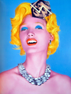
Matteo Bertolio – Tank Magazine -
2004
                                                                                Andy Warhol – Marylin -1962


These are two images by two different artists and in different times, one was created in 1962 and the other in 2004. The difference in time is going to show a difference within the image to start with because people and artists have changed and developed from those times. They can use different techniques and intensions. This is both the same kind of idea and you can see how one of them would have been inspired by the other one as they are both of similar styles and made to look as though it is the same person as they have bright colours and the same hair colour and style.
The more you look at an image the more you realise and find out and the more you get from the actual image. It is a lot more understandable as well the more you look at it and you may like or dislike the image but understanding why you like or dislike it allows you to find out things about yourself and how images effect everyone differently. We can see the similarities between these two images however they can both be original and you can see by the times the differences between the images although one artist may have been inspired by the other.


Sunday, 9 October 2011

Principle 5 - Managing a creative environment

Creative environments have a big impact on the way that we work whether we are a photography, illustrator or graphic designer. It is ok to be creative but if you have a specific place in which you are creative then you will work best there and it can often be surrounded by things that the person likes, enjoys and depending upon the person it could be crazy chaos or nicely organised. We all work better in different ways so our creative environments are very personal to each individual.

Some people may find that outside spaces can be used well as a creative environment you could take your tools and go and find a sunny bench by a river and that could be an interesting and inspiring way of working. People also like to collect things and if it is something which you enjoy it could later inspire you for a particular idea and could also be used to decorate your creative environment.

This is an image of one of my creative environments, I love this space because it is just somewhere I can sit for hours and feel totally comfortable and allow my imagination to run wild. It is quite a simple space and I don’t like to have too much around me because I feel that I get distracted from what I am trying to do if there is too much going on. I love the pink of the room, I feel as though it gives it a lovely warm glow and really allows me to be creative.


This is my second creative environment, I use this for when I am doing the computer side of things such as using Photoshop or creating my blog. I always have my drink of water and a notebook so that I am always aware of my notes and what I need to be doing. I have the pens there as well in case I come up with a creative idea and I feel as though this is also an environment in which I feel comfortable and also spend a lot of time here. I also like the screensaver on my computer as if I lose inspiration for a moment I can just sit and watch it and gather my thoughts and then continue with what I was doing previously. This is totally different to my other creative environment however I feel I need to use both of them evenly and my computer is obviously needed but this is again quite simple and allows me to concentrate easily.

I think it is really important as photographers, illustrators and graphic designers for us to all have our own individual creative environments and I think it is very interesting how no two creative environments are the same as they are a very personal thing. We could look at someone else’s creative environment and totally not understand it however it is very unique to each individual.

Principle 4 - Developing Ideational Fluency

Ideational fluency involves thinking about ideas for a certain theme, it is of the first initial stages in which you think of every possible idea and the quality doesn’t matter as much in these first stages as it is more important to the amount of ideas in which we can come up with. As we come up with ideas and become creative we can think of more and as the ideas go on they shall naturally be better and take us somewhere in which by looking at our first idea we may not have expected to end up. This whole process is about allowing us to be spontaneous and put as many ideas down as possible. We can use a whole range of techniques to show our ideas such as little sketches, comic strips, brainstorms, mind maps and classification.

Classification is where we can organise our ideas in groups of things with something in common with each other. They can be either obvious or hidden things and this can allow us to see which ideas would be able to work together and then the ones that don’t really fit, so in this case by creating a magazine it needs to be all the same sort of theme so that it looks and fits well together.

We can use brainstorming in a group and it is just an easy way of getting down lots of ideas just by writing a few words and not going in to depth about each individual idea. This works particularly well in a group as you have a wider range of ideas and you can then think of something that you may not have thought about previously.

Mind mapping is another technique we can use to show our ideas however this is a lot more organised way of thinking as it allows us to go into more detail about each individual idea and we can then put words from each category allowing us to expand upon the ideas.

This is an example a brainstorm which as you can see is just a lot of ideas on the page with not much as to organisation or expanding upon any of the individual ideas. There can be notes around some of these ideas, but they are in a way which I understand what we were discussing and so then we will be able to pick certain ideas which we choose to look at in more detail and then create a mind map on that particular theme or idea and then that shall allow us to go in to a lot more detail.


This is one of my mind maps and as you can see now this is one particular idea and I have explored the different things we could creative within this idea so they all branch off and then from them I have written words around to explain what would go in to that part. I think this is a very good way to show specific ideas.  

Monday, 3 October 2011

Develop Visual Language

Principle 3

Develop Visual Language

Using visual language to explain things is so much different to using text, long pieces of text can go on and be a bit boring however if you explain something visually it can be a lot more interesting and you can have fun with being creative and expressing yourself through images not words. There is no limit on your images and by simple drawings you can make something really complicated sounding in words very basic and simple through images. Another good thing about drawings and images is that with writing you need to be able to read and speak the language however pictures and drawings can be understood in all countries no matter what language we speak.

By using drawings it is an easy way to get your thoughts down on to paper and sometimes you can see things a lot more obvious than if they are just thoughts in your head and then this also allows us to come up with more ideas and maybe totally change from out first initial idea. It is also a place to just play around and doodle to a particular theme and it will help ideas develop and improve. You can mix and match words with pictures to make it easier to get your point across and for people to understand. There are also ways to solve problems and make visual solutions. You can record things visually if you are inspired by something and haven’t got much time to write about it you can just do a little sketch and then you can go back to it later and remember and expand upon this initial idea.  

Thinking visually means you are not limited to a certain amount of letters so you can just let your creativity run wild. You can then just use little phrases or words to help your drawings and so that you and other people know what it relates to and the general theme of it should be obvious. It can also be a lot quicker to do several little sketches rather than having to write a lot of words about every idea.
This is an example of a mind map and a way of using visual thinking with a few words to back up the images. This is a lot more interesting to look at rather than a huge piece of text and gets their point across in an understandable way which can easily be understood by all people.

This is an example of a mind map with simply just images and is exploring one particular theme so we can all clearly understand and see the ideas and thinking on the page that this person has gone through. By using colour as well adds to the creativity and makes it again more visually interesting as you can use colour to represent the same idea and then swap colours for each idea you have. By developing our visual language it shall be a lot easier to get our ideas across.

Utilize your creative brain

Principle Two

Utilize your creative brain

Our brains are split in to two halves, the left side and the right side. The left side of the brain is the very academic side and deals with organisation, numbers, critical thinking and questioning. Then there is the right side of the brain which is the creative half and this side of the brain is more like the child within us and is very playful, curious, creative, innocent and experimental. These are both opposites, however we need both sides all the time and can switch between sides without really thinking about it.

Both sides of our brain are very useful for work within our RVJ’s as we can experiment and draw and be creative using the right side of our brain and then we can reflect on what we have came up with and the questions we need to ask with the left side of our brains. By using both sides of the brain this allows us to play/evaluate and then to be spontaneous/focused.  
http://wordandimage.wordpress.com/category/science/

This is an example of an image which shows both the left and the right side of the brain in conflict as your right brain tries to say the colour and the left insists on reading the word. This shows how both sides of the brain do different things and this is something that could be set as a challenge because by looking at this it is a bit confusing and both sides of your brain want to put their part first and say either the colour or the word.  This makes us have to try really hard to do this challenge but then at the same time it is just a bit of fun and shows the two different halves of the brain.

This is an image that could be in an RVJ and by looking at this image it shows that someone has been creative and used the right side of their brain to create this image. Then by challenging it or questioning it the left half of the brain would be asking what is it for? Who is it for? What will it achieve? The left side of the brain then allows us to evaluate our creativity and just by using a few words to annotate the image and explain these questions it allows the left brain and the right brain to work together and both be satisfied.  
When we look at an image it allows us to feel something, so that would be the right side but then asking why it makes us feel like this and is that the purpose of the image would then be the left side of the brain. Images are there to visually communicate something and by using our brain to let us look and see things differently and to be able to experiment ourselves allows us to use both halves of our brain. It just shows how we need both halves and use them all the time without really realising that we are using them.